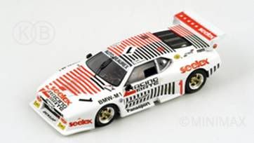
S0300
Renault Espace F1 1994


Ik wordt er nog niet echt vrolijk vanA NEW DECADE - A NEW LOGO
Over the last ten years our logo has evolved and developed in fits and starts. Our original capital "S" intended, in the back of our minds, to evoke the Tertre Rouge S at Le Mans became slimmer and the lettering, in stages, more streamlined.
Hugo Ripert, our founding partner, wanted something different, something punchier that would sit better, not just on our packaging and advertising but also on the various race cars that carry our logo from time to time. So he asked our friend Ken Okuyama to help. Ken and his associates have designed some wonderful cars, furniture and other products. They came up with some ideas and we all agreed on the same one. Here it is....
You might want to click on KEN OKUYAMA DESIGN official website http://www.kenokuyamadesign.com" onclick="window.open(this.href);return false; to check out his wonderful cars. We have modeled two of them.
